
In this tutorial, you’ll learn the basics of creating Android views by using ConstraintLayout to build the UI of your application.
A great Android app not only needs to have a beautiful UI but also optimized performance. Android provides various types of layouts that use different methods to contain child views and determine their positions. Layouts all descend from the ViewGroup class.
Some of the most common layouts to use when building your Android UI are FrameLayout, LinearLayout and RelativeLayout. They are easy to use, but they each have certain limitations and performance issues when the view hierarchy becomes complex:
- FrameLayout can only position child views by applying gravity relative to their parent.
- LinearLayout doesn’t allow views to overlap one another. But while working with complex UI we make use of multiple nested LinearLayouts which decreases performance.
- ConstraintLayout is similar to RelativeLayout in that all views are laid out according to relationships between sibling views and the parent layout, but it’s more flexible than RelativeLayout and easier to use with Android Studio’s Layout Editor.
What is ConstraintLayout?
A ConstraintLayout is a ViewGroup that allows you to position and size widgets in a flexible way.
It allows you to create large and complex layouts with a flat view hierarchy means there are no nested view groups.
All the power of ConstraintLayout is available directly from the Layout Editor’s visual tools because the layout API and the Layout Editor were specially built for each other. So you can build your layout with ConstraintLayout entirely by drag-and-dropping instead of editing the XML.
Add ConstraintLayout to your project
To use ConstraintLayout in your project, add the library as a dependency in the app level build.gradle file, as shown in the example below.
Note that the latest version might be different than what is shown in the example:
build.gradle
dependencies {

    implementation 'androidx.constraintlayout:constraintlayout:1.1.3'

}
Constraints
Constraints are the basic building blocks of ConstraintLayout. A constraint represents a connection or alignment to another view, the parent layout, or an invisible guideline. Each constraint defines the view’s position along either the vertical or horizontal axis.
To define a view’s position in ConstraintLayout, you must add at least one horizontal and one vertical constraint for the view.
If a view has no constraints when you run your layout on a device, it is drawn at position [0,0] (the top-left corner).
Rules for constraints
- Every view must have at least two constraints: one horizontal and one vertical.
- You can create constraints only between a constraint handle (circle on each side of an element) and an anchor point ( this point can be the edge of another view, the edge of the layout, or a guideline) that share the same plane. That means a handle on one axis (such as horizontal) can’t be connected to a handle on another axis (such as vertical).
- Each constraint handle can be used for just one constraint, but you can create multiple constraints (from different views) to the same anchor point.
Handles
A Constraint is essentially a defined rule for a view which declares it’s positioning and alignment on screen, the ConstraintLayout supports several different types of handles.
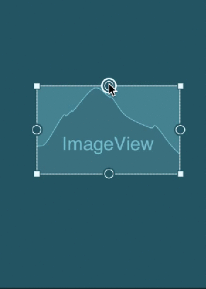
Resize Handle
You can drag the square resizing handles to resize the element. While dragging, the handle changes to an angled corner.

Drag corners to resize the image. By resizing the image, the width and height are fixed to specific dimensions.

Constraint Handle
The constraint handle can be used to specify the location of the view within the layout.
Click a constraint handle, shown as a circle on each side of an element, and then drag to another constraint handle or to parent boundary to create a constraint. The constraint is represented by the zigzag line.

For example, these anchors can be used to define that the selected view is always displayed to the right of another view, by a specified margin dp value.

Or by setting the desired view attribute in the XML layout:
app:layout_constraintRight_toRightOf="@+id/img_first"
Baseline Constraint Handle
By using a baseline constraint, you can vertically align elements that have text, such as a TextView, EditText, or Button, so that the text baselines are aligned.
Use baseline constraints to align elements that use different text sizes.
Baseline constraints are also useful for aligning the text baselines of elements of different sizes.

This can be set in the layout editor by dragging the baseline anchor of the desired TextView to the baseline of another TextView:

Now the above two TextViews move together and stay aligned.
Or by setting the desired view attribute in the XML layout:
<TextView
    android:id="@+id/small_text"
    android:layout_width="114dp"
    android:layout_height="72dp"
    android:text="TextView"
    app:layout_constraintBaseline_toBaselineOf="@+id/big_text"
    tools:layout_editor_absoluteX="264dp" />
Note: A baseline constraint handle can be connected only to another baseline.
Adding Constraints
To add a constraint, do the following:
1.Drag a view from the Palette window into the editor.
When you add a view in a ConstraintLayout, it displays a bounding box with square resizing handles on each corner and circular constraint handles on each side.

2.Click the view to select it.
3.Do one of the following:
- Click a constraint handle and drag it to an available anchor point. This point can be the edge of another view, the edge of the layout, or a guideline.
- Click one of the Create a connection buttons in the Layout section of the Attributes window, as shown below:

Deleting Constraints
Within the layout editor, you can easily remove constraints from a view. This can be done in one of two ways.
Single Constraints
You can remove a single constraint by simply clicking on the anchor point of the constraint that you wish to delete.
- Click on a constraint to select it, and then press Delete.
- Press and hold Control (Command on macOS), and then click on a constraint anchor.

- In the Layout section of the Attributes window, click on a constraint anchor, as shown below:

All Constraints
When a view is selected, right-click and select Clear Constraints of Selection. Now it will remove all of the constraints that have been set on that view.

The view inspector
The Attributes pane shows the view inspector in a square block at the top. The view inspector shows the UI element’s constraints and margins, and sliders for adjusting the position of the element along the horizontal and vertical axis.

In the above figure:
- Margin values appear on all four sides. Change a margin by clicking the value and choosing a different value.
- Inner lines indicate the constrained width and length.
- Use sliders to change the horizontal and vertical constraint bias for elements with opposing constraints.
Position elements with constraint bias
Horizontal Bias
This allows us to position a view along the horizontal axis using a bias value, this will be relative to it’s constrained position.

We can set this using the slider in the layout editor (seen above) or using the attribute in our XML like so:
app:layout_constraintHorizontal_bias="0.5"
verticle Bias
This allows us to position a view along the vertical axis using a bias value, this will be relative to it’s constrained position.

We can set this using the slider in the layout editor (seen above) or using the attribute in our XML like so:
app:layout_constraintVertical_bias="0.5"
Change the element’s layout width and height
The inner lines within the view inspector let you change the UI element’s layout_width and layout_height values relative to constraints. Clicking an inner line cycles through the following options for vertical and horizontal constraints:
Fixed: Specify the width/height of the element.
Match Constraints: Allow the element to occupy all available space to satisfy the constraint. (Note that this is not the same as the match_parent value for width or height, which sets the element to occupy all available space of the parent view. You shouldn’t use match_parent for any view in a ConstraintLayout.) In the XML file, the value 0dp appears in the layout_width or layout_height attribute for Match Constraints.
Wrap Content: Expand the element as needed to fit its content.
AutoConnect Tool

Auto-connect allows you to place a view inside the layout editor and have it automatically calculate and set the constraints for you.
The Autoconnect tool  is located in the toolbar. It is enabled by default. For this exercise, ensure that the tool is enabled.
In the blueprint or the preview, click, then drag any of the views near the corners of the parent view or towards the center of the layout until dotted guidelines appear. As you do so, Android Studio will automatically create new constraints for you.

Manual Constraints
It’s possible to disable auto-connect if you wish to manually set the constraints within the layout editor. Personally, this gives you much more control over the constraints and saves you time deleting the constraints you don’t need that were automatically set.

To use manual constraints you need to disable auto-connect:

Infer Constraints

The Infer Constraints tool infers, or figures out, the constraints you need to match a rough layout of elements. It works by taking into account the positions and sizes of the elements. Drag elements to the layout in the positions you want them, and use the Infer Constraints tool to automatically create the constraint connections.
Before we click on infer constraints tool the layout look like this:

Click the Infer Constraints tool. The Layout Editor adds constraints to all of the unconstrained elements in the layout. The resulting layout should look like the following:

What’s the difference between Inference and Autoconnect?
The Infer Constraints  tool calculates and sets constraints for all of the elements in a layout, rather than just the selected element. It bases its calculations on inferred relationships between the elements.
The Autoconnect tool creates constraint connections for a selected element to the element’s parent.
Default Margin
To create vertically-distributed constraints, you simply connect constraints that have the same margins. A trick to do this quickly is to use the Default Margin tool.
click Margin  in the toolbar to select the default margin for each view that you add to the layout.

After setting the default margin to 60dp when we constrain a view with another view or with parent layout then it will be separated by 60dp.

Clear All Constraints

If the constraints are messed up, you can clear all constraints and restart from scratch. To continue, clear your current constraints with the Clear All Constraints button.
Use ratios to size elements
You can quickly resize elements by aspect ratio if at least one of the element’s dimensions is set to match constraints.
By using ratios you can ensure your designs stay perfect while allowing images to be resized on different device screens.
You can see the entire action and result in the following animated figure:

I hope this article will help you in understanding ConstraintLayout, it’s capabilities and how we can use it to create more efficient layouts within our applications.